New Features
Break Through The Noise: Introducing the Operations Overview Dashboard
February 15, 2021

At Samsara, our goal is to give our customers a connected operations platform that surfaces actionable and valuable insights. While remote monitoring gives you access to data that can make your operations more efficient, identifying the most critical metrics in an instant can be challenging. Our customers have struggled to sift through data and alerts for multiple regions, job sites, and equipment types when they just need one holistic overview to start their day.
That’s why we’re excited to announce the operations overview dashboard, an easy to use, interactive, and real-time view into the indicators that are most actionable for your business. The operations overview dashboard is:
A concise summary of the equipment metrics that are most important to your business
Customizable with the ability to color-code, sort, filter, and rearrange columns
Interactive with links out to asset dashboards, alarms, and deeper analysis
Real-time and automatically updated when assets move regions or job sites
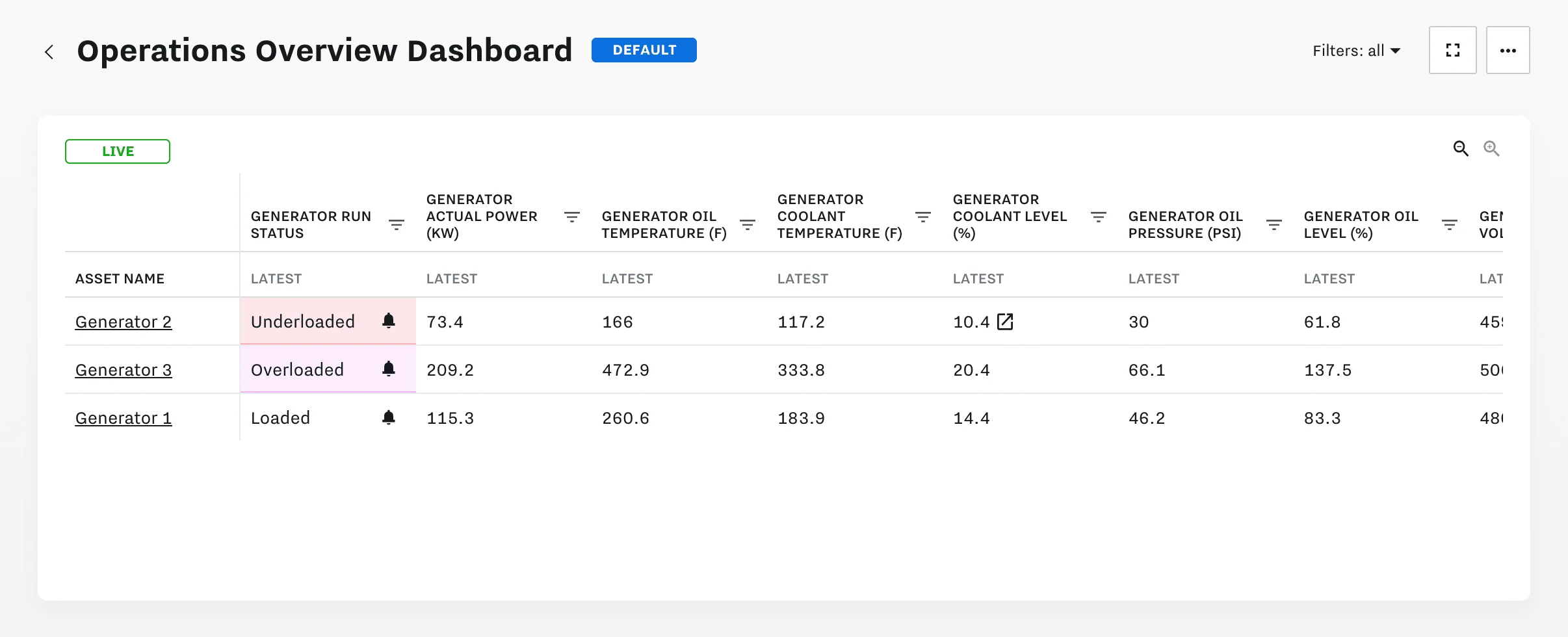
High Priority Indicators in One View
The operations overview dashboard gives our customers 90% of the information they need to take action or make decisions. Each metric can be customized with alarm state colors and each column can be sorted or filtered in order to pull attention to high priority indicators. For example, a generator rental company may sort by load status while a boiler distributor may check alarm colors for high cycle counts, both of which can indicate potential for failure.
Click In for More Details
Start the day by reviewing the operations overview dashboard and use it as a hub to click into detailed readings for your equipment. Not only does each asset link out to customized dashboards, you can also click into each data point to see historical trends over time and to compare it across other metrics. A bell icon will appear next to any metric that’s alarming--you can hover over it for a quick look or click in to see the full notification.
Live Data with Automatic Updates
Each operations overview dashboard can be easily customized according to region, job site, end customer, equipment type, and more. Because the dashboard shows live data, it is consistently refreshed with updates. For example, a field services company may have mobile assets that move between regions or job sites, each with its own overview dashboard. Whenever an asset changes location, it will automatically show up on the latest dashboard so that operations managers always have a complete view.
The operations overview dashboard is just one more way we’re helping our customers do more with their data, from their fleets to worksites to equipment and assets in the field. Learn more about how to set up the dashboard in the user guide or reach out to start a free trial.


